PK效果
伪类
<view class="pk-line" @click="handleClickBar">
  <view class="pk-progress">
    <view class="left" :style="{ width: leftWidth + '%' }"></view>
    <view class="right" :style="{ width: rightWidth + '%' }"></view>
  </view>
  <view class="pk-text">
    <view class="text left">
      {{ leftWidth }}%{{ postData.pkOptionA }}
    </view>
    <view class="text right">
      {{ rightWidth }}%{{ postData.pkOptionB }}
    </view>
  </view>
</view>
.pk-line {
  width: 100%;
  .pk-progress {
    display: flex;
    height: 40rpx;
    .left {
      min-width: 40rpx;
      background: linear-gradient(90deg, #ff4322 0%, #ffe0c2 100%);
      border-radius: 20rpx 0rpx 0rpx 20rpx;
      position: relative;
      &::before {
        content: "";
        width: 0;
        height: 0;
        border-width: 0 0 40rpx 15rpx;
        border-style: solid;
        border-color: transparent transparent #fff transparent;
        position: absolute;
        right: 0;
        top: 0;
      }
    }
    .right {
      min-width: 40rpx;
      flex: 1;
      background: linear-gradient(90deg, #bdeeff 0%, #0ac1ff 100%);
      border-radius: 0rpx 20rpx 20rpx 0rpx;
      position: relative;
      &::before {
        content: "";
        position: absolute;
        width: 0;
        height: 0;
        border-width: 0 0 40rpx 15rpx;
        border-style: solid;
        border-color: transparent transparent transparent #fff;
        left: 0;
        top: 0;
      }
    }
  }
  .pk-text {
    display: flex;
    justify-content: space-between;
    align-items: center;
    height: 52rpx;
    .text {
      text-align: justify;
      font-size: 26rpx;
      white-space: nowrap;
      &.left {
        color: #999999;
        font-weight: 400;
      }
      &.right {
        color: #45d0ff;
        font-weight: 500;
        background-image: url(https://******** */.png);
        background-size: 26rpx 23rpx;
        background-position: left center;
        background-repeat: no-repeat;
        padding-left: 35rpx;
      }
    }
  }
}
clip-path
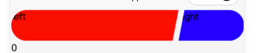
无意间看到的 效果参考
.bar {
  display: flex;
  justify-content: space-between;
  border: 40rpx;
  overflow: hidden;
  .left {
    flex: 1;
    height: 100rpx;
    background: red;
    clip-path: polygon(0 0, 100% 0, calc(100% - 10px) 100%, 0 100%);
  }
  .right {
    width: 100rpx;
    height: 100rpx;
    background: blue;
    clip-path: polygon(10px 0, 100% 0, 100% 100%, 0 100%);
  }
}